Avvenire SharePoint Web Parts
Upgrade Your SharePoint Experience with Our Beautiful, Time-Saving Web Parts!
Slideshow

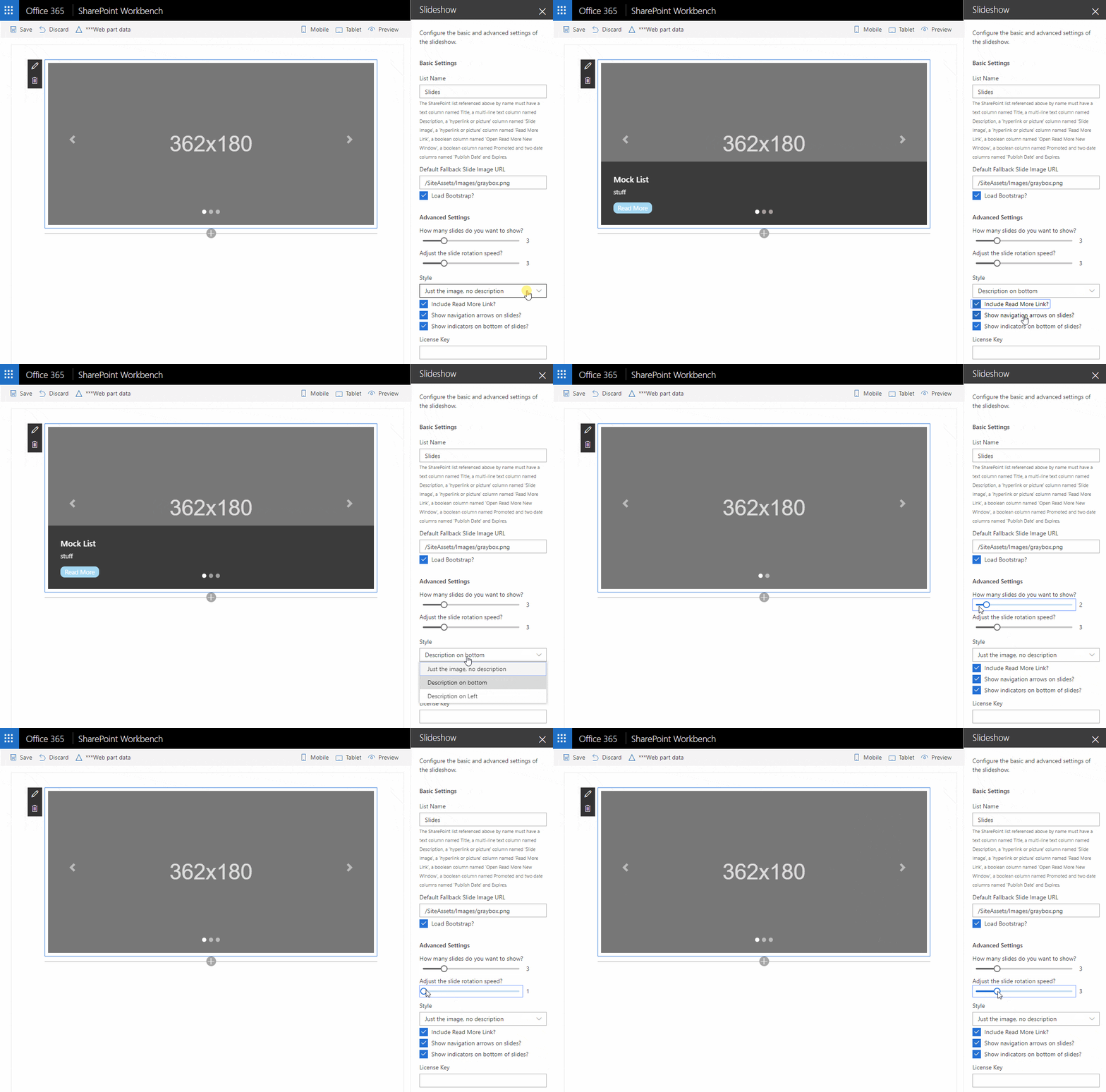
This web part will create a slideshow powered by a SharePoint list!
Features & Options:
- How many Slides do you want to show? This determines how many images will appear in the carousel from the SharePoint list. The App Part will pull the first ten items from the list.
- Adjust the slide rotation speed? This is the number of seconds an image will appear before rotating to the next image.
- Style This sets whether or not the slides description is on the slide or its location on the slide.
- Include Read More Link? This determines whether you have a link to the SharePoint item the slider pulls from in the SharePoint list
- Show navigation arrows on slides? This setting determines whether or not arrows appear on either end of the slide, allowing users to navigate back and forth between slides.
- Show indicators on bottom of slides? This setting determines whether or not the indicators at the bottom of the slide appear. This displays how many slides are in the carousel and which slide is currently appearing.
“Fancy” Event List

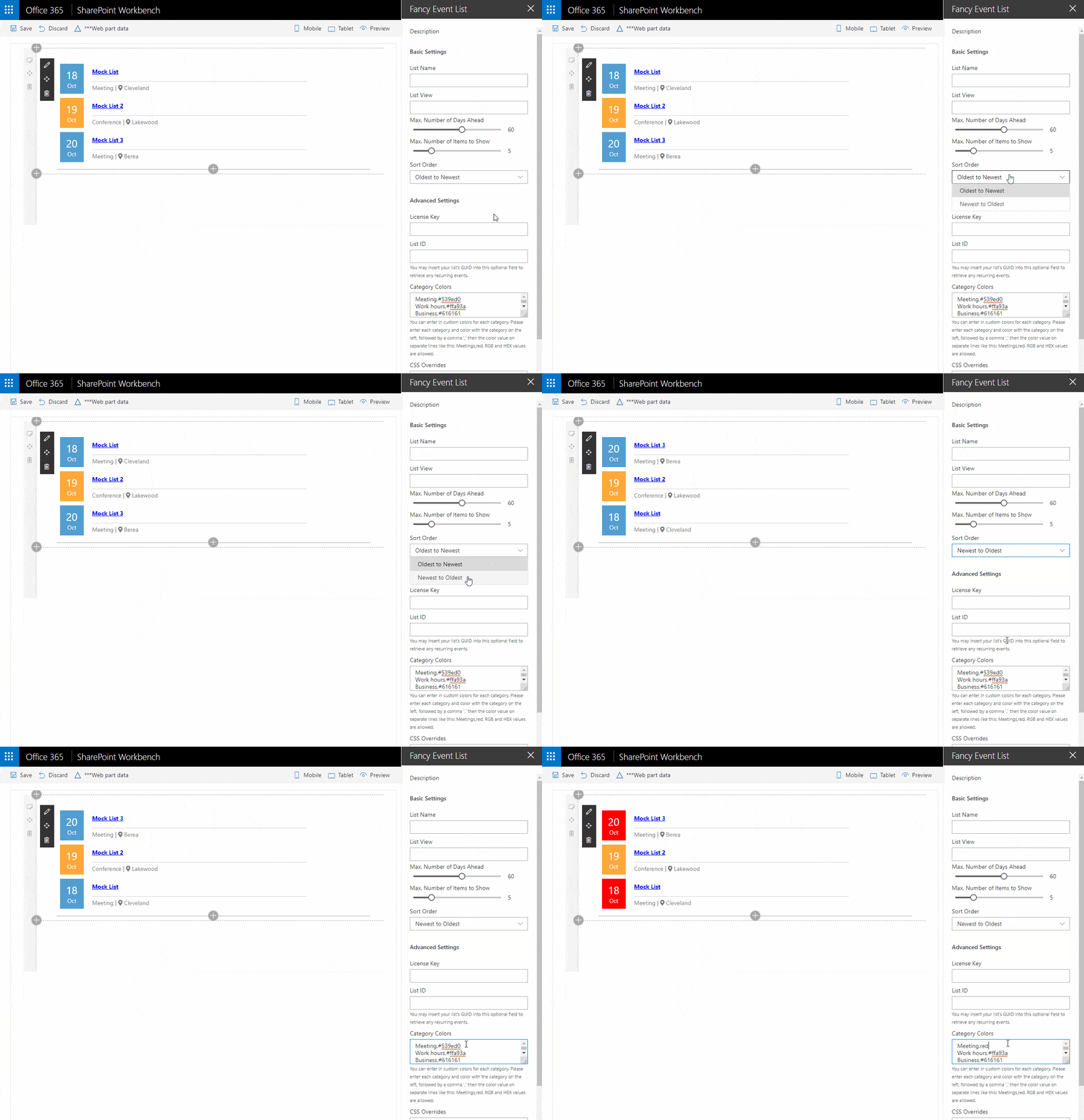
This web part will display a your SharePoint events with style!
Features & Options:
- List Name This field specifies the name of the list from which you would like to retrieve your items.
- List View Optionally, you may retrieve your items from a View based on the List. You may enter your View name in this field to do so.
- Max number of days ahead This determines how many days in the future to search.
- Max number of items to show This sets how many list items to display.
- Sort Order List items may be sorted in ascending or descending order.
- License Key Please populate this field with your license key in order to use this web part.
- List ID If you would like to include recurring events, the List GUID can be entered here which is found in the URI of the list’s detail page and looks like, “d53c87d5-23f7-414a-9cc7-920ec806af95.”
- Category Colors You may specify the colors of each event type category with a hex code.
- CSS Overrides Custom CSS classes can be entered to override any of the existing styles.
Birthdays & Anniversaries
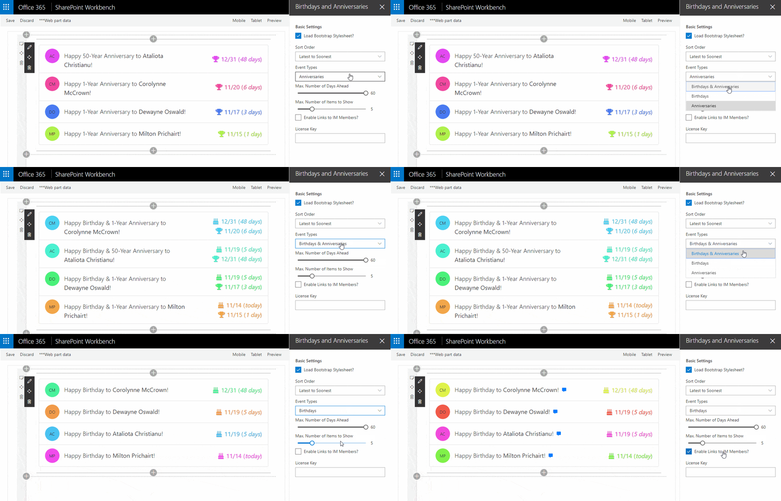
This web part uses data from Azure Active Directory to display users’ upcoming birthdays or work anniversaries!
Features & Options:
- Load Bootstrap Stylesheet This determines whether or not Bootstrap is loaded. You may want to turn this off if you’re underlying template or other web parts on the page are already using Bootstrap to avoid loading it more than once.
- Sort Order Items can be sorted soonest to latest (ascending order) or latest to soonest (descending order).
- Event Types Events displayed can be configured as “Birthdays & Anniversaries,” “Birthdays,” or “Anniversaries.”
- Max. Number of Days Ahead This determines the maximum number of days to search ahead to find any upcoming events.
Set to 0 Days to show today’s Birthdays and Anniversaries only.
- Max number of items to show This sets how many list items to display.
Simple News (with Icon)
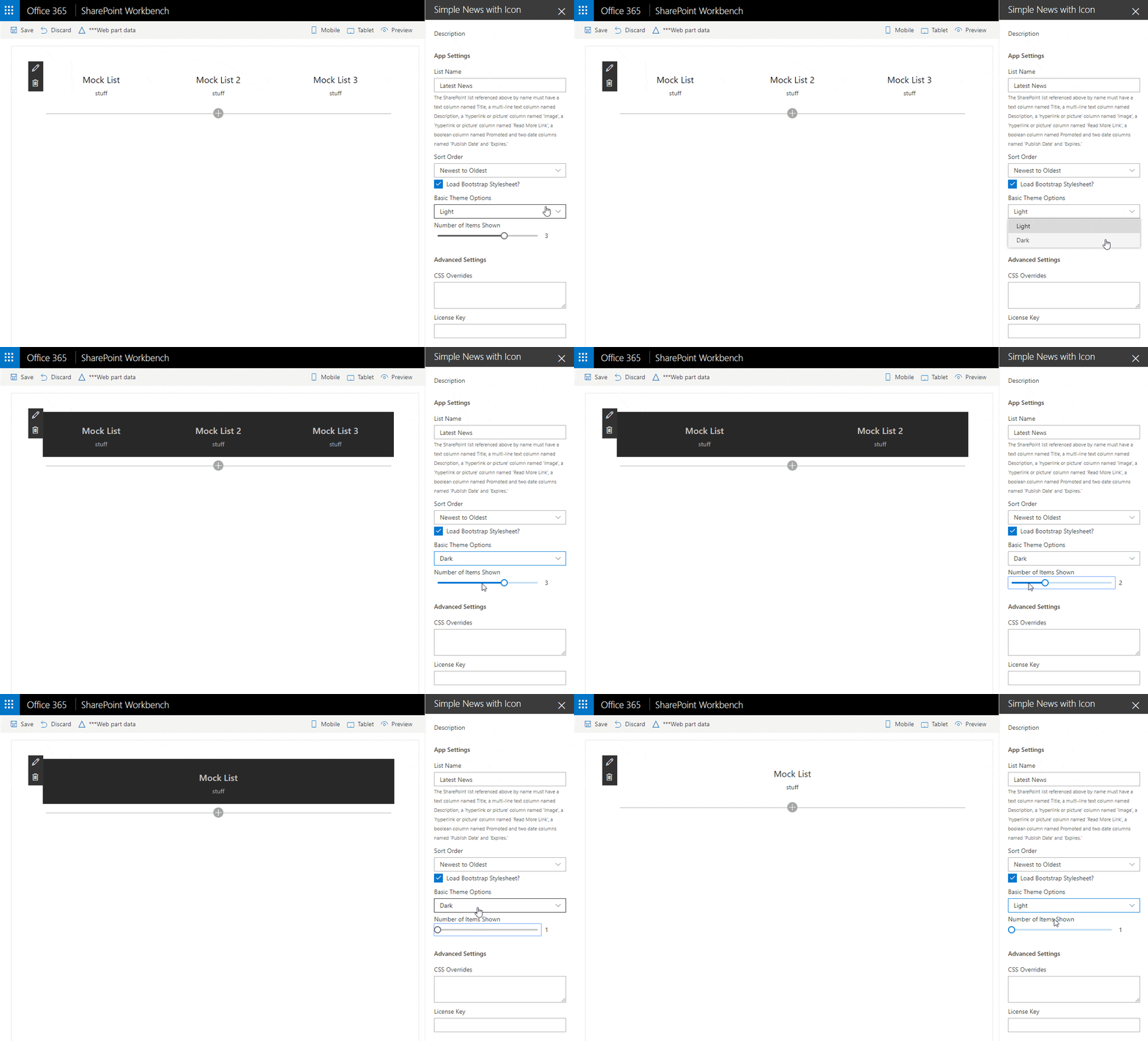
This web part will create stylized boxes for SharePoint list items!
Features & Options:
- List Name This field specifies the name of the list from which you would like to retrieve your items.
- Sort Order List items may be sorted in ascending or descending order.
- Load Bootstrap Stylesheet This determines whether or not Bootstrap is loaded. You may want to turn this off if you’re underlying template or other web parts on the page are already using Bootstrap to avoid loading it more than once.
- Basic Theme Options You may select either a Light or Dark theme to style your list.
- Number of items to shown This sets how many list items to display.
- CSS Overrides Custom CSS classes can be entered to override any of the existing styles.
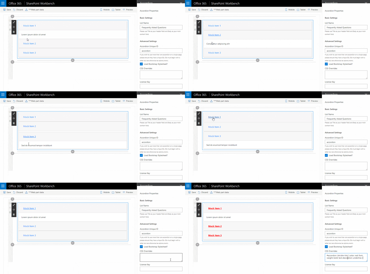
Accordion
This web part will create expandable content sections with clickable headers based on a SharePoint list!
Features & Options:
- List Name This field specifies the name of the list from which you would like to retrieve your items.
- Accordion Unique ID You may utilize this field to successfully show more than one accordion within the same page (accordions must have unique IDs to function properly).
- Load Bootstrap Stylesheet This determines whether or not Bootstrap is loaded. You may want to turn this off if you’re underlying template or other web parts on the page are already using Bootstrap to avoid loading it more than once.
- CSS Overrides Custom CSS classes can be entered to override any of the existing styles.
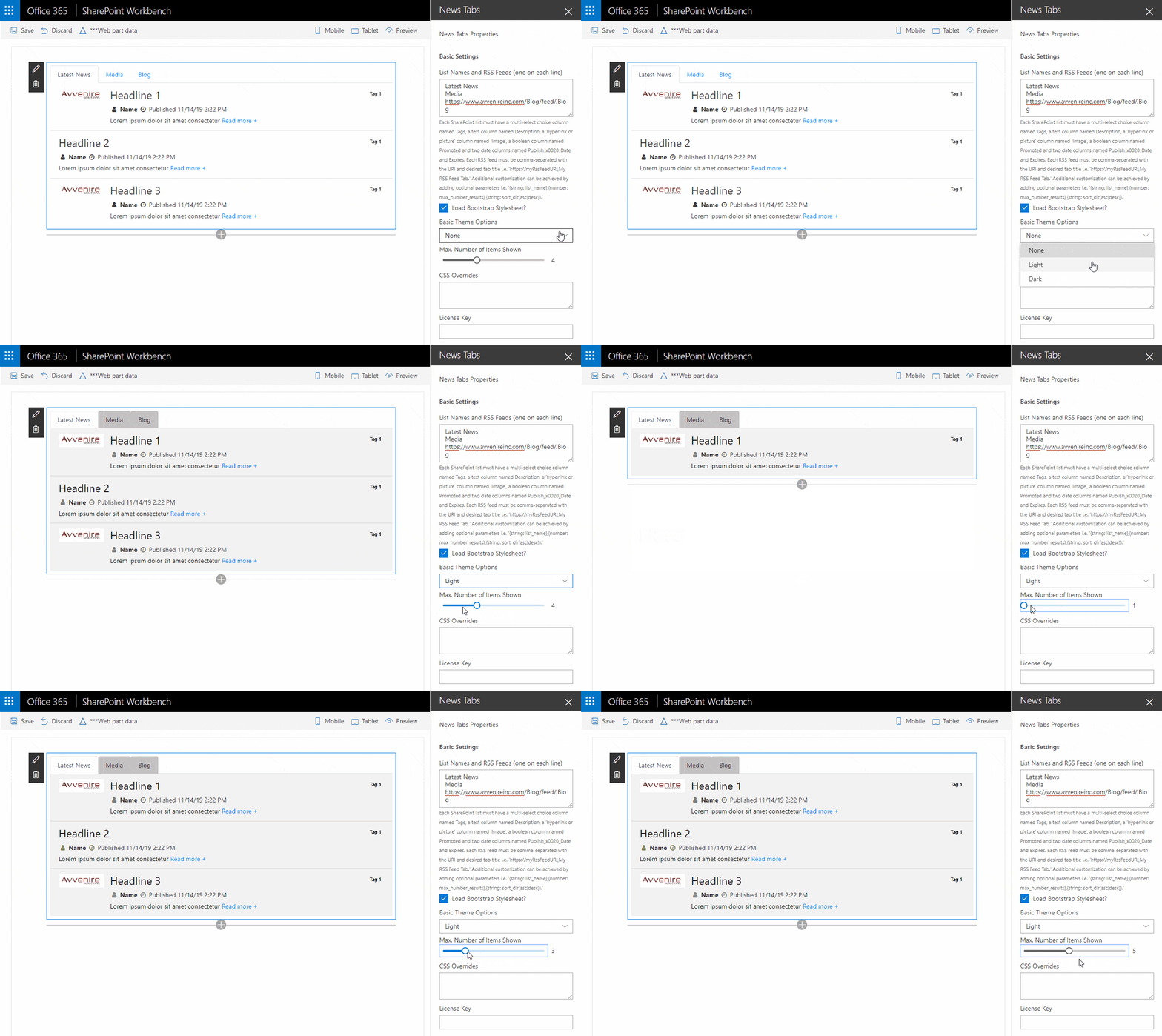
News Tabs
This web part will group and format news items into tabs and supports both SharePoint lists and RSS feeds as data sources!
Features & Options:
- List Names and RSS Feeds This field specifies the names of the lists and/or the web addresses of the blogs from which you would like to retrieve your items. You may optionally specify the order in which you might like the items to be returned; either ascending or descending order.
- Load Bootstrap Stylesheet This determines whether or not Bootstrap is loaded. You may want to turn this off if you’re underlying template or other web parts on the page are already using Bootstrap to avoid loading it more than once.
- Basic Theme Options You may select either a Light or Dark theme to style your list.
- Number of items to shown This sets how many list items to display.
- CSS Overrides Custom CSS classes can be entered to override any of the existing styles.
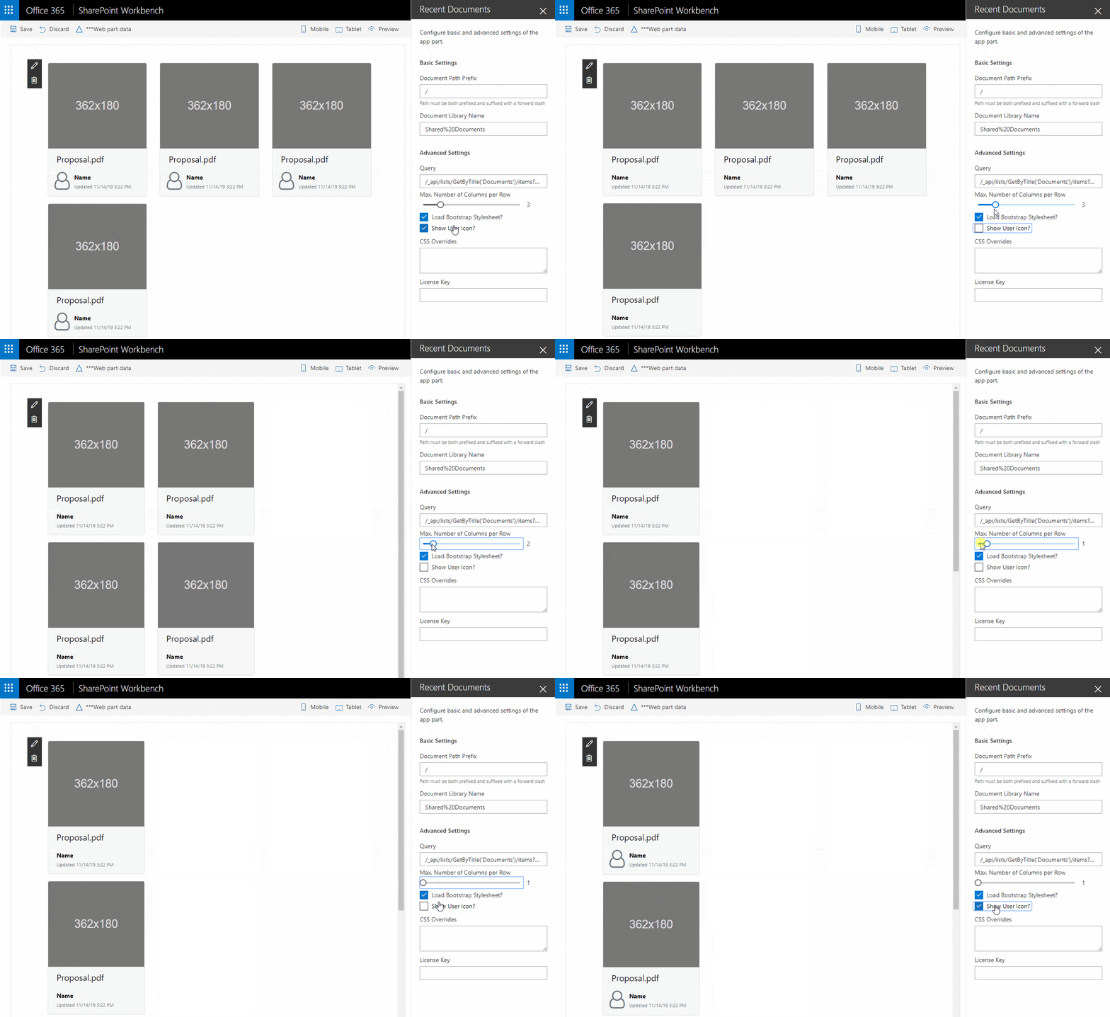
Recent Documents

This web part will group and format news items into tabs and supports both SharePoint lists and RSS feeds as data sources!
Features & Options:
- Document Path Prefix The document path prefix can be used when and if the document library lives in a location divorced from the current site context i.e. in a subsite.
- Document Library Name This field specifies the name of the document library from which you would like to retrieve your items.
- Query This field is provided to support customization of the actual API query that gets sent to the server to retrieve items from the document library.
- Max. Number of Columns per Row The determines the maximum number of columns in which to display the items for each row.
- Load Bootstrap Stylesheet This determines whether or not Bootstrap is loaded. You may want to turn this off if you’re underlying template or other web parts on the page are already using Bootstrap to avoid loading it more than once.
- Show User Icon The determines whether or not the user icon will be displayed next to their name.
- CSS Overrides Custom CSS classes can be entered to override any of the existing styles.
